Discussion What looks better in this case? Or what is better considered of the design?
- Thread starter Jonny
- Start date
- Moderator
- #2
Hey Jon!
The rules of typography are not set, there is never a single best way.
But you should always try to think about what message you want to tell to your audience.
In this case, you already went for a very subtle style of telling,
so if that is the emotion you want to catch go for that one!
But if you want to lay the focus specifically on the "love", the question gets difficult.
Especially because meanwhile making the font bold has a very cool effect, there might be other ways,
better for you project.
If you already have a corporate design you can give the "love" another color. (if you don`t it works fine too)
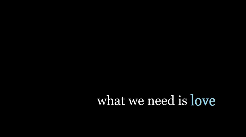
you could make it a lighter color to give it focus and symbolize its importance:

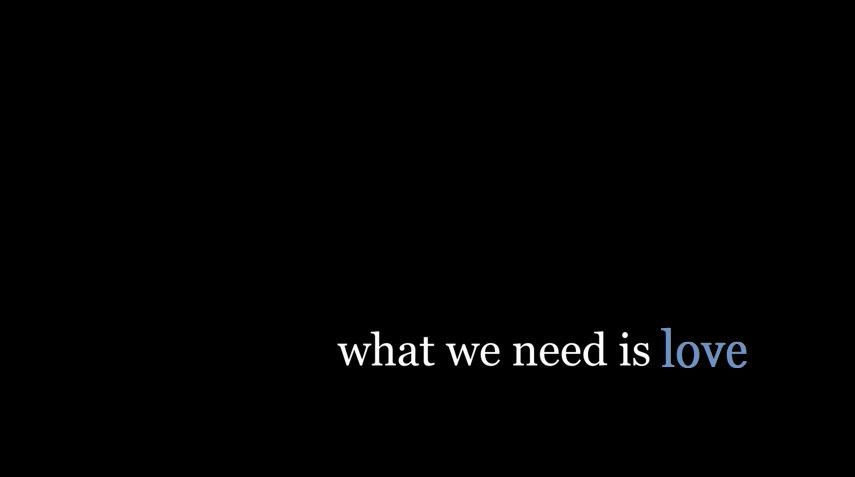
if you don`t want it to have focus, but rather make the sentence important, meanwhile signalizing that love is special you can also
add a darker color:

As somebody, that doesn't know the context of this sentence, I prefer the most simple way, which is just making a subtle statement.
Hope I was able to give you a second thought on your project!
See you on board.
-Rhyme
The rules of typography are not set, there is never a single best way.
But you should always try to think about what message you want to tell to your audience.
In this case, you already went for a very subtle style of telling,
so if that is the emotion you want to catch go for that one!
But if you want to lay the focus specifically on the "love", the question gets difficult.
Especially because meanwhile making the font bold has a very cool effect, there might be other ways,
better for you project.
If you already have a corporate design you can give the "love" another color. (if you don`t it works fine too)
you could make it a lighter color to give it focus and symbolize its importance:
if you don`t want it to have focus, but rather make the sentence important, meanwhile signalizing that love is special you can also
add a darker color:
As somebody, that doesn't know the context of this sentence, I prefer the most simple way, which is just making a subtle statement.
Hope I was able to give you a second thought on your project!
See you on board.
-Rhyme

